
Giving a location intelligence platform a brand as smart as its tech.
- Client
- Purple
- Partner
- Direct-to-client
- Scope
- Brand identity, logo, colour and typography, visual language, brand guidelines, product UI, OOH
The Challenge
Purple serves venues as different as hotels, shopping centres and stadiums, with a platform that does much more than connect people to WiFi. Its identity needed to be flexible enough for all of those audiences and consistent enough to be instantly recognisable. Above all, it had to look as innovative as the technology behind it.
The Solution
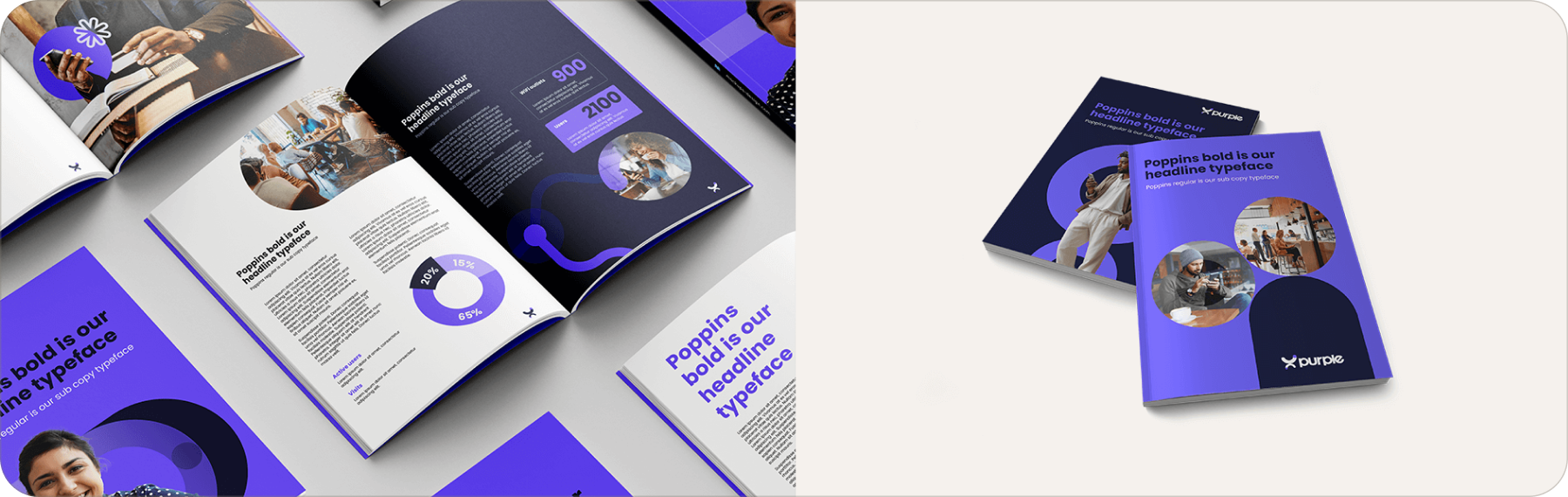
Just led a complete redesign of Purple's visual identity. That meant a new logo with its own construction rules, plus a refreshed colour palette, typography and visual language. The system was set out in brand books and put to work across the product dashboard, branded imagery and new website. The result is one consistent, impactful Purple wherever it shows up.

One brand, every touchpoint.
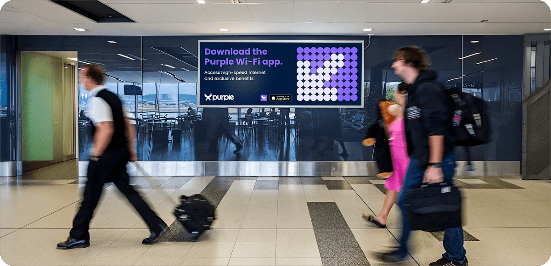
A new logo, colour palette, typography and visual language, brought together in brand books. It works everywhere Purple shows up, from the product dashboard to branded imagery and out-of-home.
Built to be different.
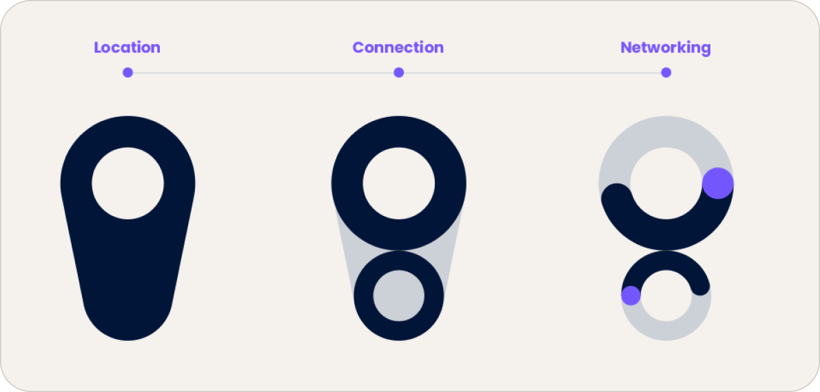
Location, connection, networking: three ideas, one mark.
Let’s take
a closer look.
Tell us your briefest challenge. Or send us your most challenging brief. We’re ready to go.
Contact us